Client
Mortar & Pestle
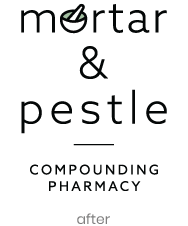
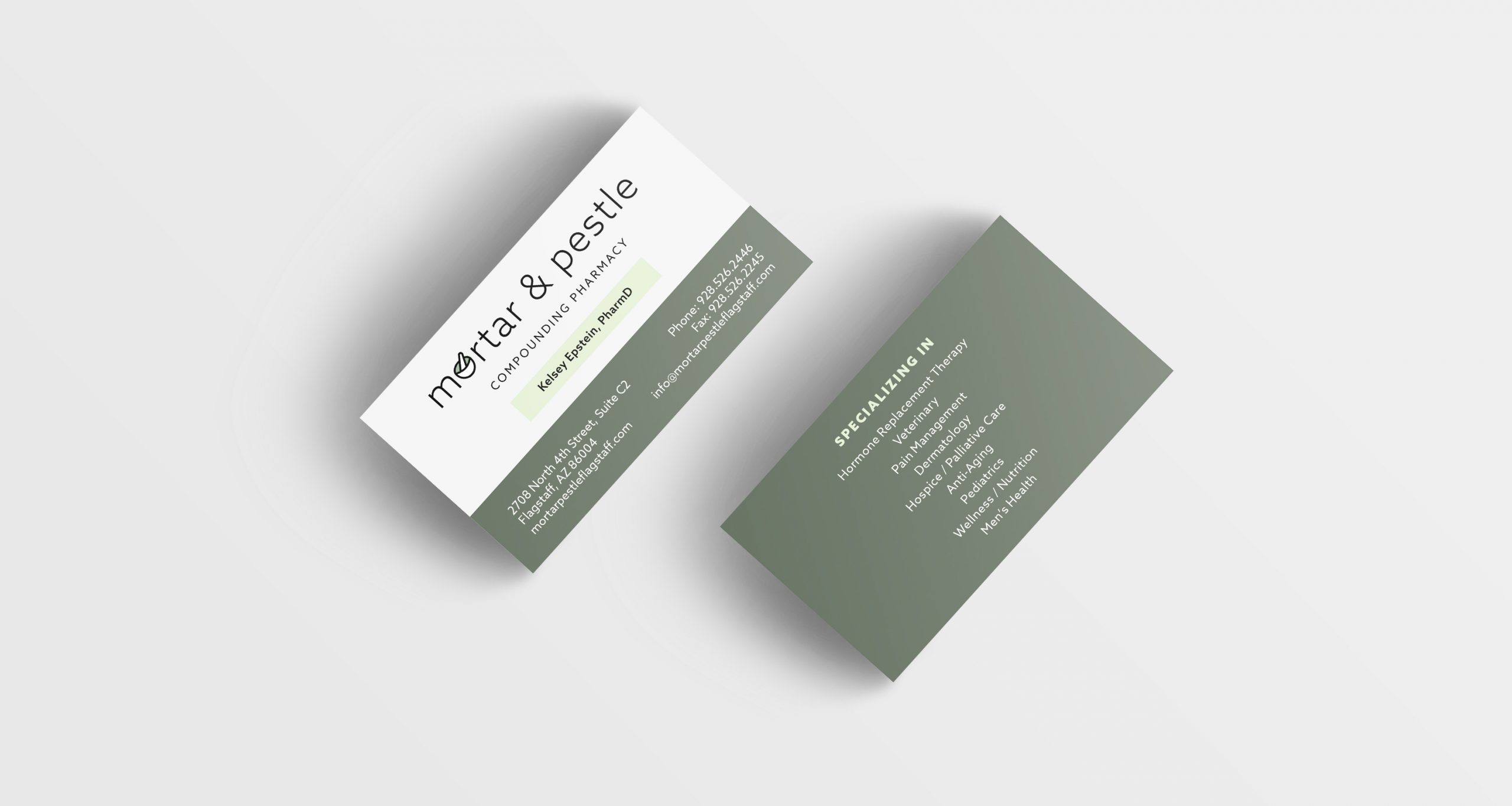
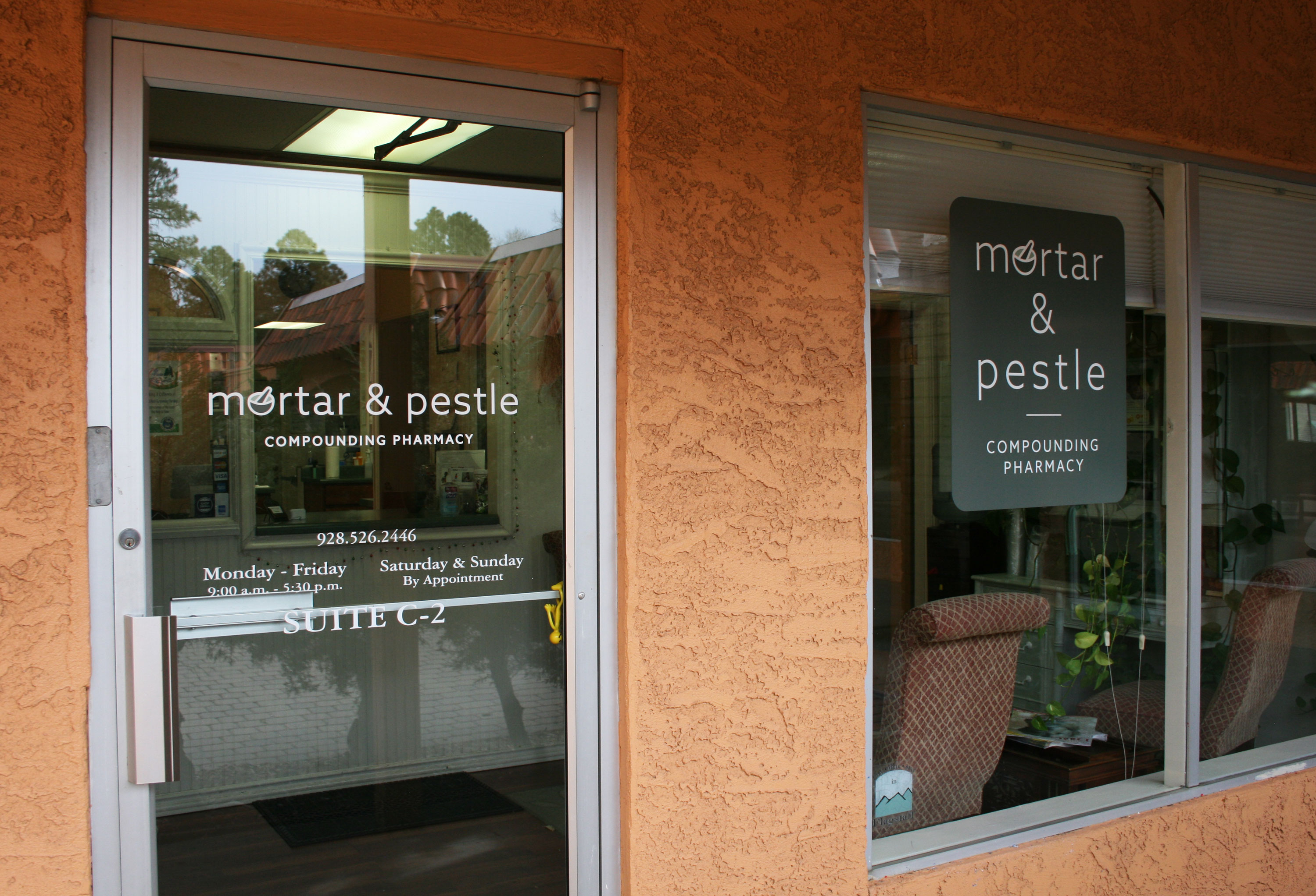
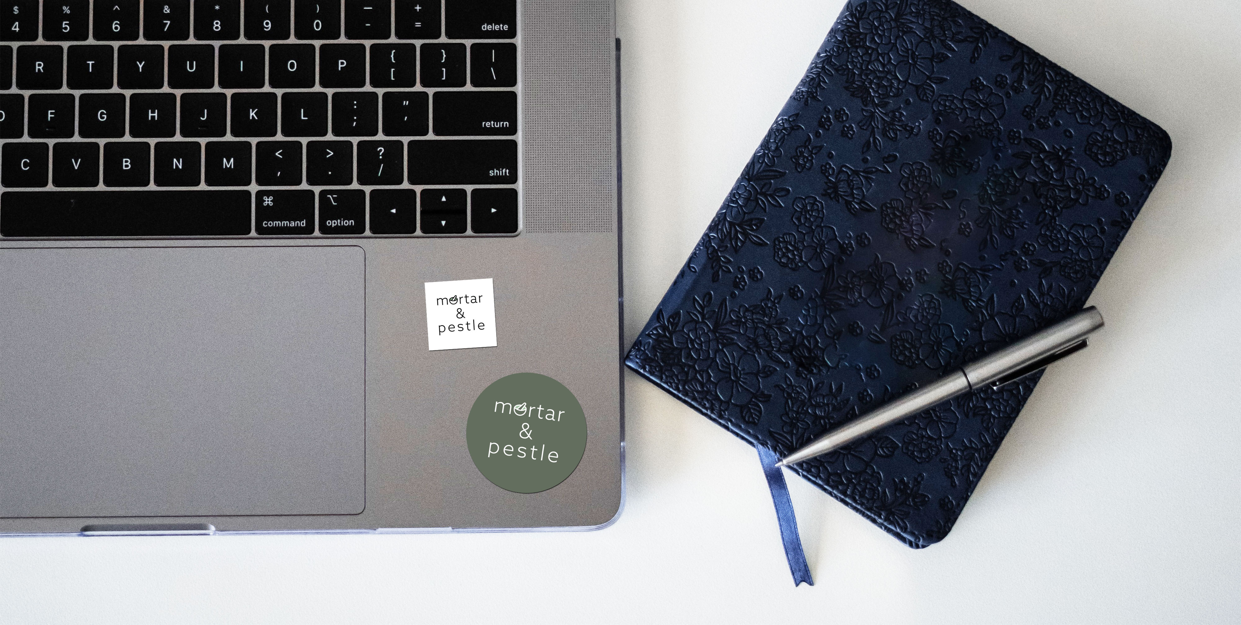
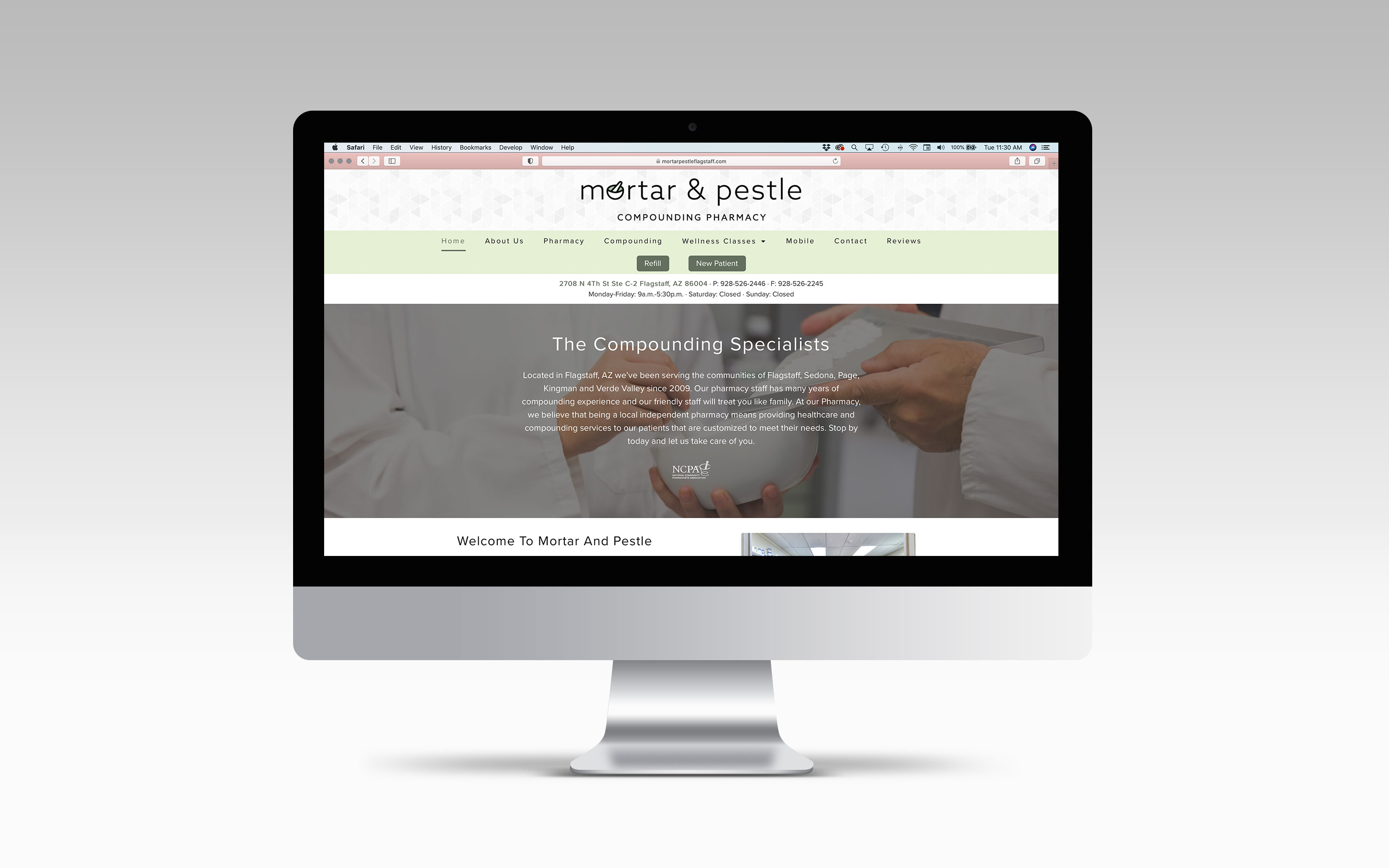
After seeing HiLow Creative’s work in rebranding, the new owner of Mortar & Pestle approached Courtney to create a new logo for her pharmacy. The owner wanted the new logo and branding to better reflect her own style - minimal, clean, modern, and versatile. HiLow Creative thought it important to keep the mortar & pestle imagery, but in order to align with the owner’s style, integrated it into the typography for a simple yet memorable look.

